
InStrength
A supplement product page rebuilt around the pack decision, and a split test that settled it.
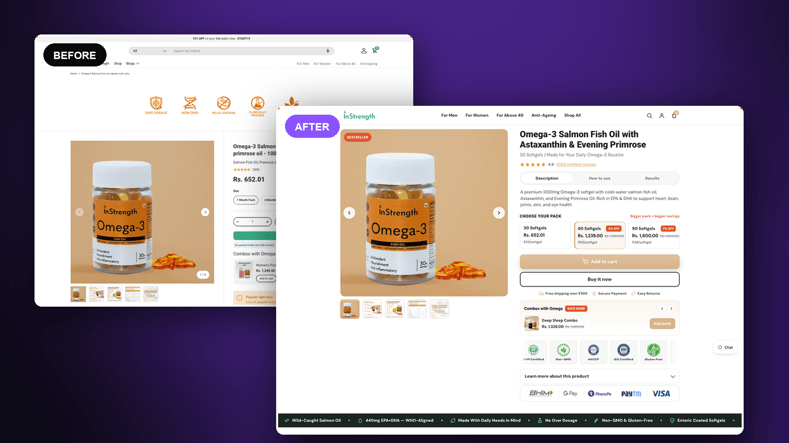
The result
+58%
Add-to-cart rate vs the original
12.94% → 20.38%
How to read this: Statistically significant: 99% win chance, p = 0.02 across 546 visitors. The interval around the size of the lift is still wide — roughly +9% to +106% — so read +58% as the best estimate rather than a precise figure. The new page also took 3 orders against 0, but that sample is far too small to claim anything from.
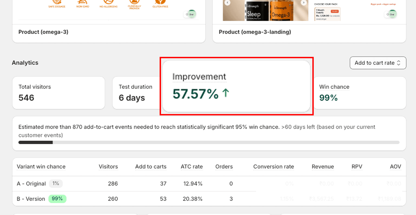
The test as it stands in Shopify, at 99% win chance against the 95% threshold.
The brief
InStrength sells clinically-positioned supplements direct to consumers. Their Omega-3 product page had every ingredient a buyer could want — certifications, thousands of reviews, a real clinical story — arranged in an order that asked the visitor to assemble it themselves. We rebuilt the page around the decision it exists to serve: which pack do I buy?
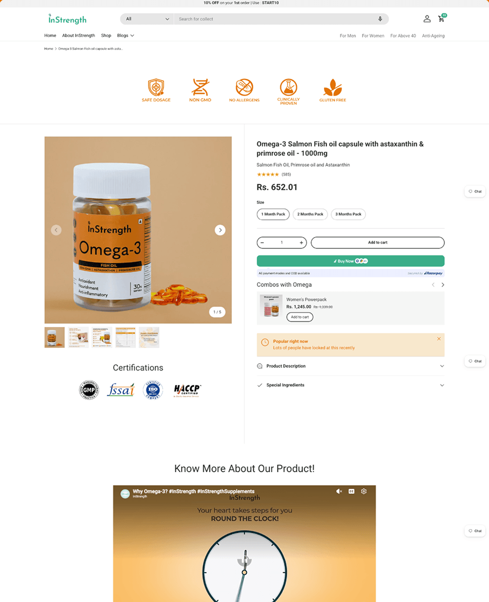
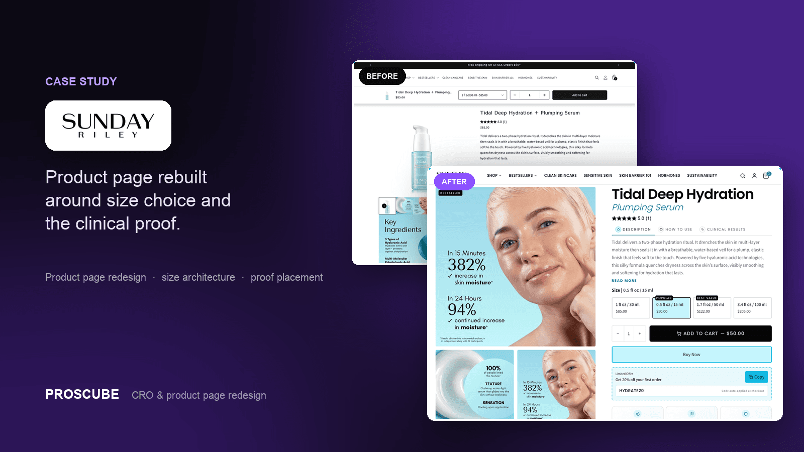
The proof was on the page, just never where the decision was. A band of trust icons — safe dosage, non-GMO, clinically proven — sat above the product, disconnected from the price. The certifications sat below the fold. The description and ingredients were collapsed behind accordions, so the case for the product was one tap away from anyone skimming.
The buying choice was the weakest part of it. Three pack options — one, two and three months — were plain unpriced buttons, so the page never showed what a bigger pack saved you and gave no reason to pick one over another. Add to cart was an outlined control beside a quantity stepper, visually quieter than the Buy Now button next to it. The rating showed as bare stars and a count, carrying none of the weight that thousands of reviews should.
Our role
- Conversion rate optimization
- Product page redesign
- Pack and pricing architecture
- A/B test design and analysis
What we built
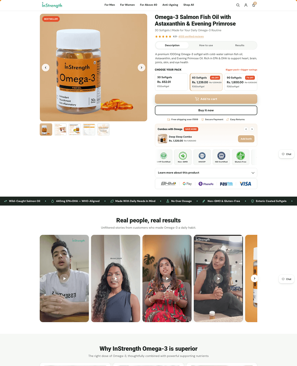
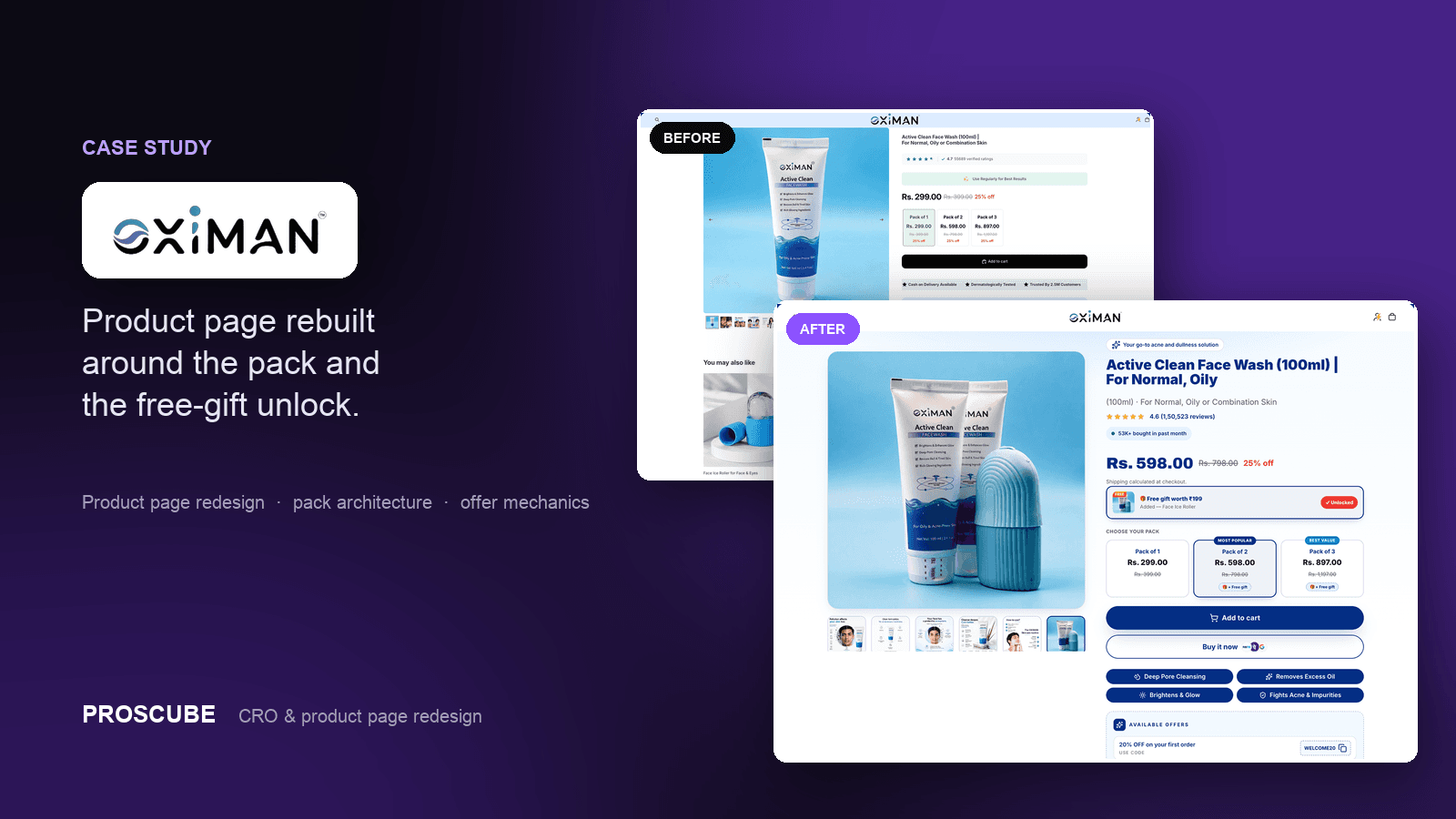
We rewrote the top of the page so it answers, in order, what this is, who it is for, and whether anyone else trusts it. The name is restated in plain language with a line on what you get and how it fits a routine, and the rating moves up beside it as “4.9 · 4105 verified reviews” — a specific, linked claim rather than a row of stars.
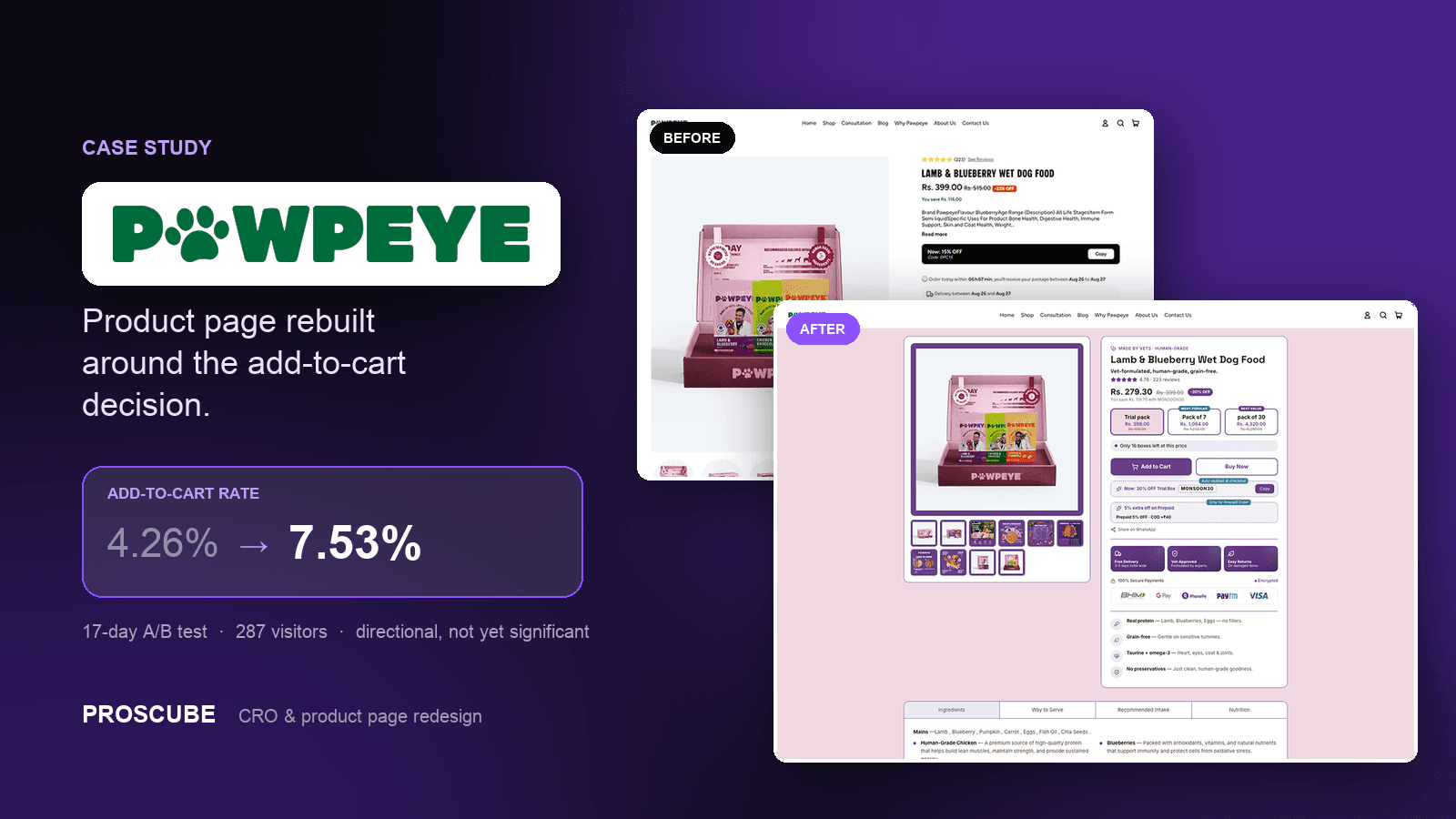
The pack selector is the centre of the rebuild. Three sizes now carry their price, their per-softgel unit price, and their discount, under one line: bigger pack = bigger savings. Showing the unit price is what makes the larger pack legible as a better deal rather than just a bigger number, and it turns a choice the old page left unexplained into the page's main event.
Everything a buyer needed in order to trust the purchase moved next to the purchase. Certifications, payment methods, the free-shipping threshold, secure payment and returns now sit inside the buying block instead of scattered above and below it. Add to cart became the primary control, with Buy it now beneath it, and the description opened into tabs — description, how to use, results — so the case is readable without a tap.
Below the decision we added a benefit bar and a wall of customer video, so the clinical claims are followed by real customers saying the same thing in their own words. The mobile layout was rebuilt in parallel, where the pack selector and the review count now land above the fold.
Before and after
See the difference.
Product page
The original against the rebuild — same product, same traffic, split 50/50.
The outcome
We ran the rebuild against the original as a 50/50 split test. Add-to-cart rate went from 12.94% to 20.38% — 53 add-to-carts on the new page against 37 on the old, across 546 visitors in six days.
Unlike a good deal of what gets published as a CRO result, this one clears the bar: 99% win chance, p = 0.02, and a confidence interval that excludes zero. The effect is real. Its exact size is less certain — the interval runs from roughly +9% to +106% — so +58% is the best estimate rather than a precise figure, and a longer run would tighten it.
Services in this project
Got a project?
Let’s build yours next.
Tell us your store URL and what you’re trying to solve. You’ll hear back within one business day — an honest read on whether we’re the right fit.