
Pawpeye
A product page rebuilt around the add-to-cart decision, then split-tested against the original.
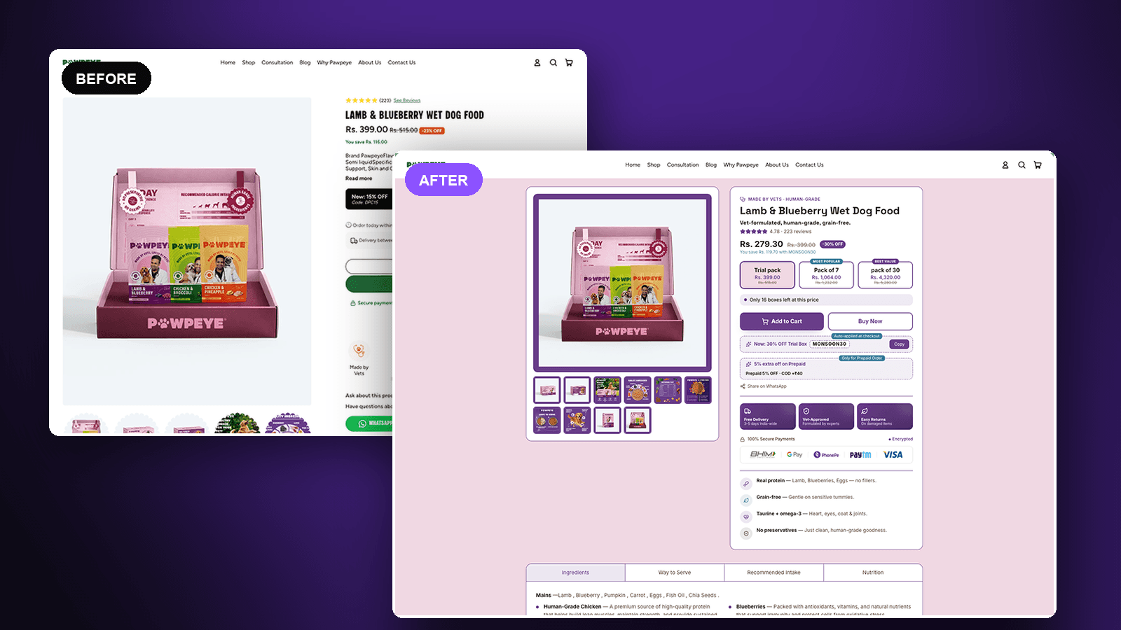
The result
+77%
Add-to-cart rate vs the original
4.26% → 7.53%
How to read this: Directional, not established. 87.4% win chance against the 95% bar for significance, on 6 vs 11 add-to-cart events. The test needs more traffic before this figure is settled.
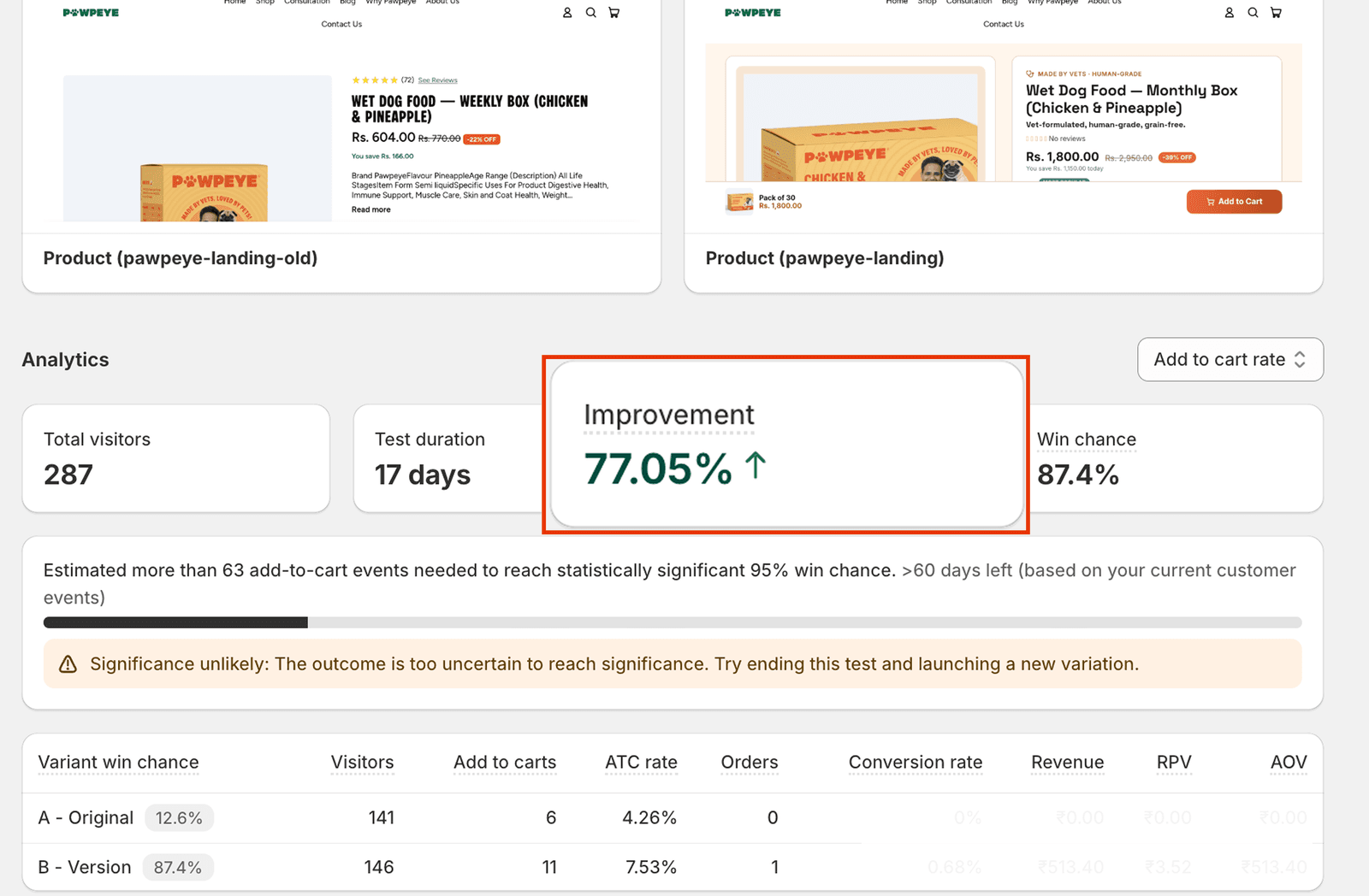
The test as it stands in Shopify, including the platform’s own note that the result has not reached significance.
The brief
Pawpeye sells vet-formulated, human-grade wet dog food direct to consumers. The product page was where the money was being decided, and where it was being lost. We rebuilt it around a single question: what does a dog owner need to see before they add to cart?
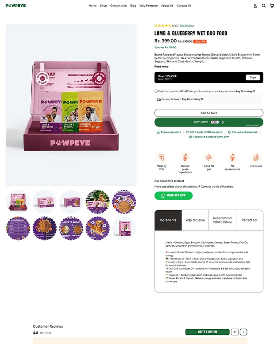
The original page led with an unformatted specification dump — brand, flavour, age range, item form and intended use run together in a single block of text, cut off behind a "Read more" link. There was one price and one buying option, so the page never made a case for the larger pack. Reviews existed but sat as a small line of stars above the title. The strongest trust signals the brand had — vet formulation, human-grade ingredients, real customers — were reduced to a row of small icons, and the primary support route was a WhatsApp link rather than anything that answered objections on the page itself.
Our role
- Conversion rate optimization
- Product page redesign
- Offer and pack-size architecture
- A/B test design and analysis
What we built
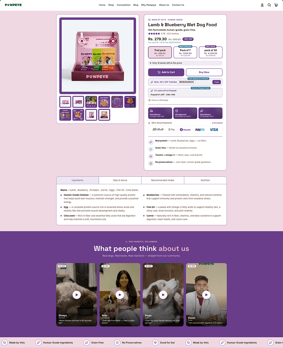
We rewrote the top of the page as a proposition rather than a spec sheet: a plain product name, a one-line description that says what it is and who it is for, and the rating and review count promoted to sit directly under the title where they carry weight.
The single buying option became a three-tier pack selector — trial, pack of 7, pack of 30 — with the middle tier badged as most popular and the largest as best value. That gives the page an anchor and a reason to trade up, which one price alone never provides.
Around the decision itself we surfaced everything a buyer would otherwise have to hunt for or trust blindly: the discount and what it saves, an auto-applied code, the prepaid incentive, delivery timing, returns, and the accepted payment methods. Add to Cart and Buy Now sit side by side, so a decided buyer is not routed through the cart.
Below the fold, the ingredient information was restructured from a run-on paragraph into tabbed, scannable sections, and we added a wall of customer video testimonials — real owners and their dogs — so the social proof is something a visitor can watch rather than a number they have to believe. The whole layout was rebuilt for mobile in parallel, where most of this traffic lands.
Before and after
See the difference.
Product page
The original page against the rebuild — same product, same traffic, split 50/50.
The outcome
We ran the new page against the original as a 50/50 split test for 17 days. The redesign led on add-to-cart rate throughout — 7.53% against 4.26% on the original, across 287 visitors.
We are reporting that as a directional result, not a proven one. The difference rests on 11 add-to-cart events versus 6, and at that sample size the test had not reached statistical significance: the platform put the win probability at 87.4%, short of the 95% threshold, and estimated it needed roughly 63 add-to-cart events to get there. The honest read is that the redesign is ahead and nothing suggests it is behind, but the size of the gain is not yet established. The test needs more traffic before a number is worth quoting.
Services in this project
Got a project?
Let’s build yours next.
Tell us your store URL and what you’re trying to solve. You’ll hear back within one business day — an honest read on whether we’re the right fit.