
Sunday Riley
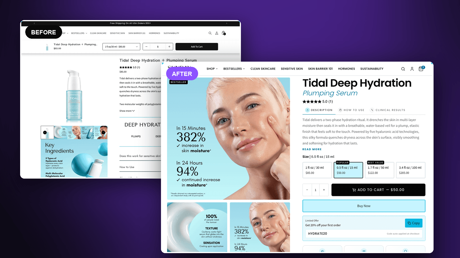
A serum product page rebuilt around size choice and the clinical proof it already owned.
The brief
Sunday Riley is a prestige skincare brand with clinical data most competitors would build an entire page around. On the Tidal serum page that evidence existed but was filed away behind accordions, while the page offered a single size at a single price. We rebuilt it so the proof does its job at the moment of decision, and so there is more than one way to say yes.
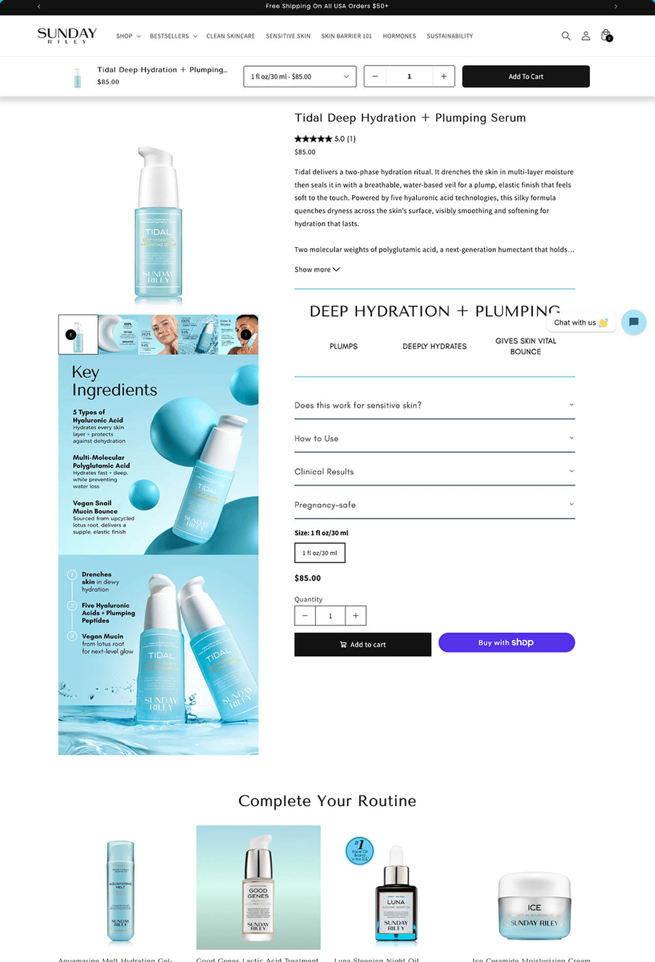
There was one size, one price: 30ml at $85. For a prestige serum that is a single, fairly high hurdle — no trial size for a first-time buyer, and nothing above it for someone already convinced.
The clinical numbers — a 382% increase in skin moisture in 15 minutes, 94% continued increase at 24 hours, 100% of testers rating the texture — sat in the image carousel a visitor had to scroll through, and in a Clinical Results accordion that stayed shut by default. A persistent chat widget covered part of the buying area. The description ran long before a Show more link, and the product gallery stacked awkwardly down the page rather than sitting beside the decision.
Our role
- Conversion rate optimization
- Product page redesign
- Size and pricing architecture
- Proof and claim placement
What we built
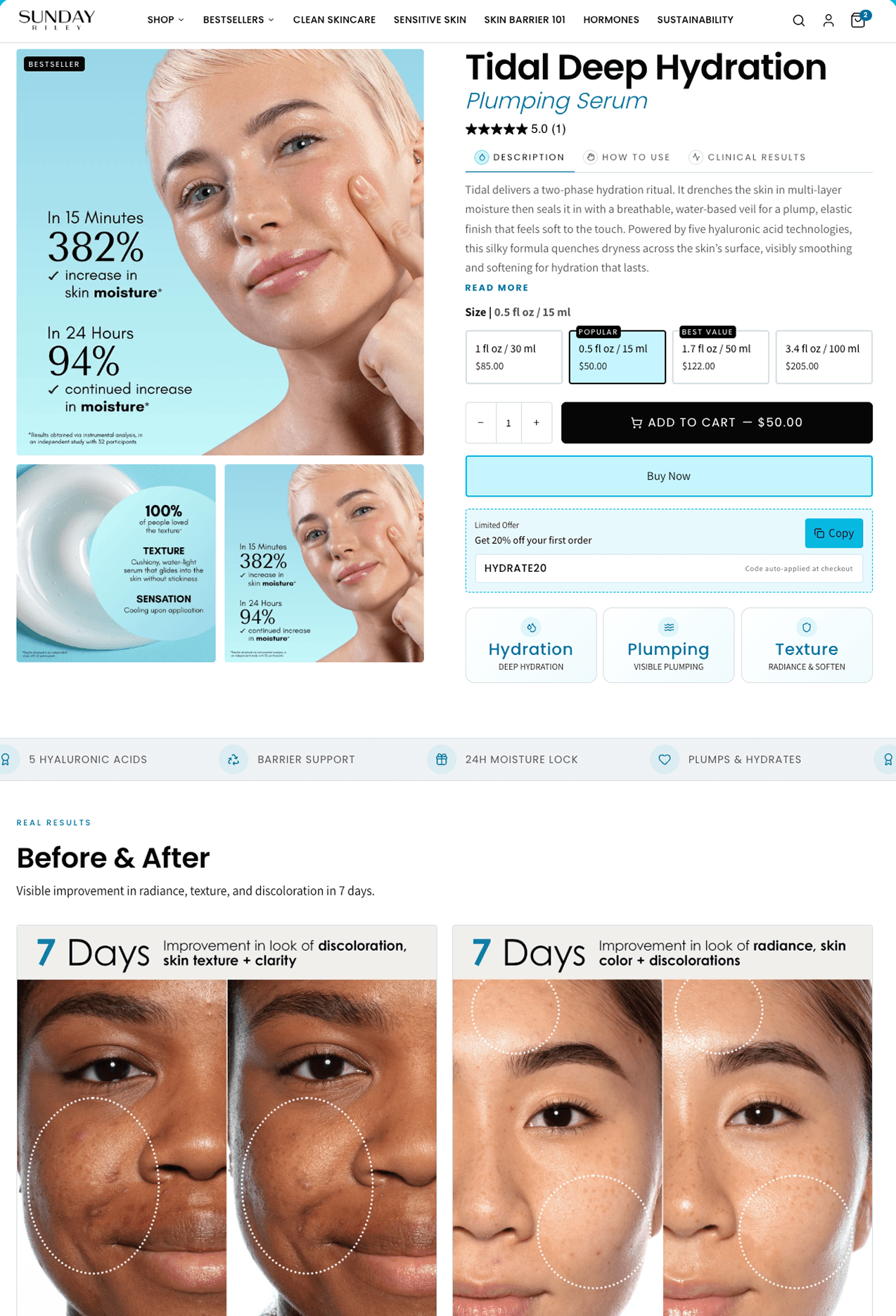
One size became four. 15ml at $50, 30ml at $85, 50ml at $122 and 100ml at $205, with the 15ml badged popular and the 50ml best value. That gives a hesitant first-time buyer a $50 way in and a convinced one somewhere to go, and the page now defaults to the trial size rather than asking for $85 up front.
The clinical evidence moved to the front. The 382% and 94% moisture results, and the 100% texture rating, are now the hero imagery rather than something to be discovered inside an accordion — the strongest thing this brand has to say, said where the decision is made.
The accordions became tabs. Description, how to use and clinical results now sit in one row with the description open by default, so the case can be read without opening anything. Add to cart carries the live price of the selected size, and Buy Now sits beneath it for people who have already decided.
Under the buttons we surfaced the first-order offer as a copyable, auto-applied code rather than something to be found at checkout, added a row of benefit cards, and gave the page a real Before & After section — 7-day results photography that a skincare buyer will look for and that the old page never showed.
Before and after
See the difference.
Product page
The original against the rebuild.
The outcome
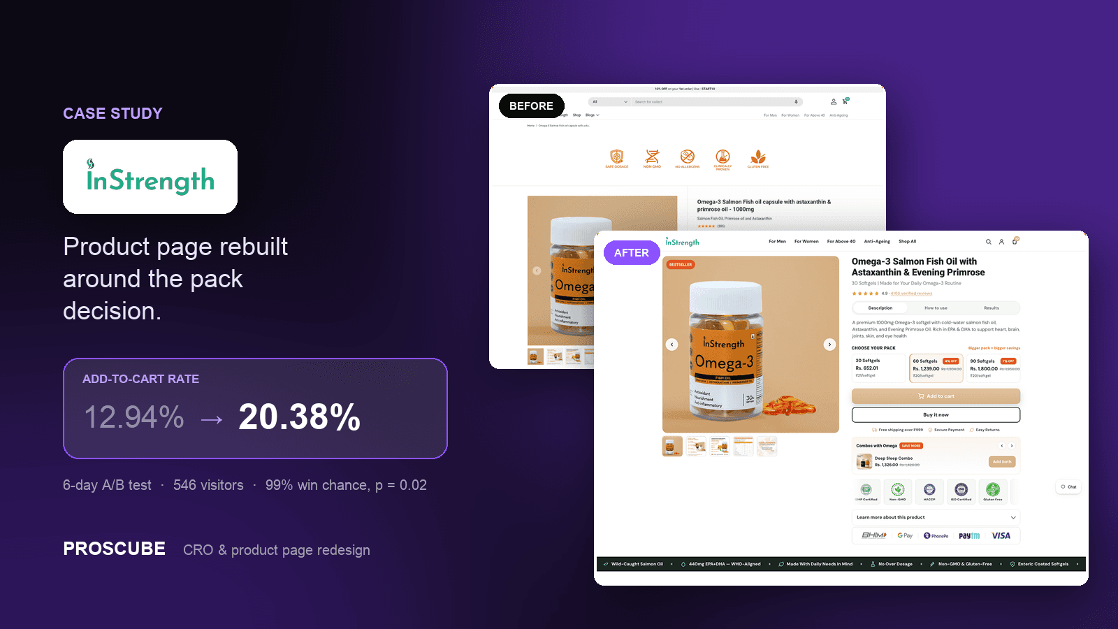
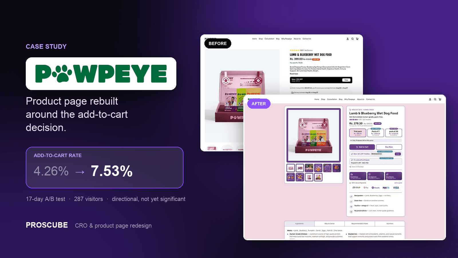
Conversion improved after the rebuild shipped. We are not putting a number on it here — this engagement predates the split-test setup we now run on every CRO project, so there is no controlled before-and-after we would be willing to publish as a measurement. The comparison below is what changed; the InStrength case study is where the same approach is measured properly.
Services in this project
Got a project?
Let’s build yours next.
Tell us your store URL and what you’re trying to solve. You’ll hear back within one business day — an honest read on whether we’re the right fit.