
Oximan
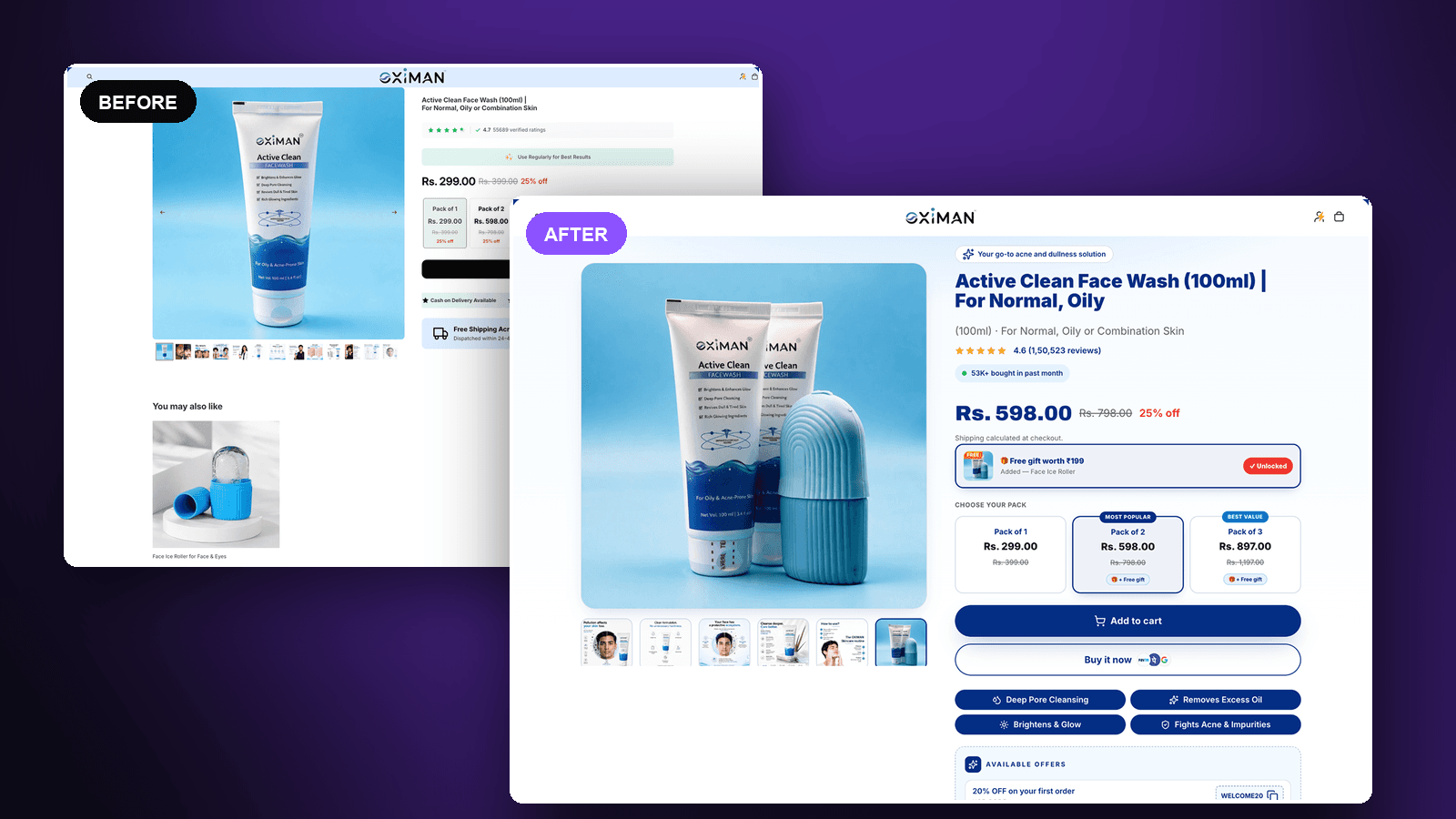
A men’s skincare product page rebuilt around the pack choice and a free-gift unlock.
The brief
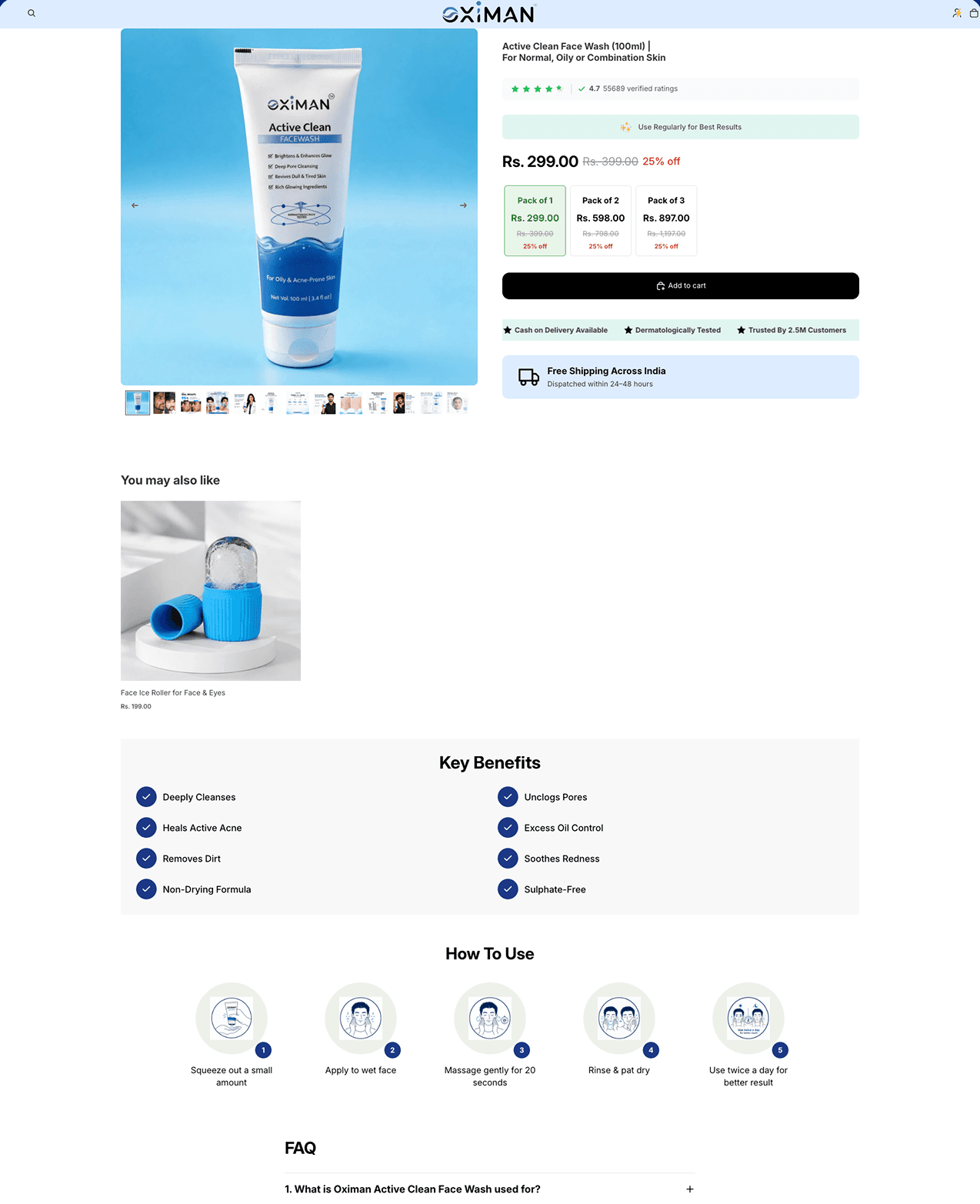
Oximan sells men’s skincare direct to consumers. The Active Clean face wash page already had the raw material of a strong page — a large review count, a three-pack ladder, real trust claims — but each of those sat in its own box, none of them arguing for anything. We rebuilt the page so every element pushed toward one decision: which pack, and why not the bigger one?
The pack ladder was the clearest miss. Packs of one, two and three were all discounted at the same 25%, so trading up bought you nothing extra and the page gave no reason to prefer one. It defaulted to the single pack, the cheapest and least valuable option.
The ice roller sat further down the page as a separate ₹199 cross-sell under “You may also like”, competing for the same wallet rather than supporting the sale. Add to cart was the only call to action, with no express path. The benefits, the how-to and the FAQ were all present but stacked far below the buying block, so the case for the product arrived after the moment it was needed.
Our role
- Conversion rate optimization
- Product page redesign
- Pack and offer architecture
What we built
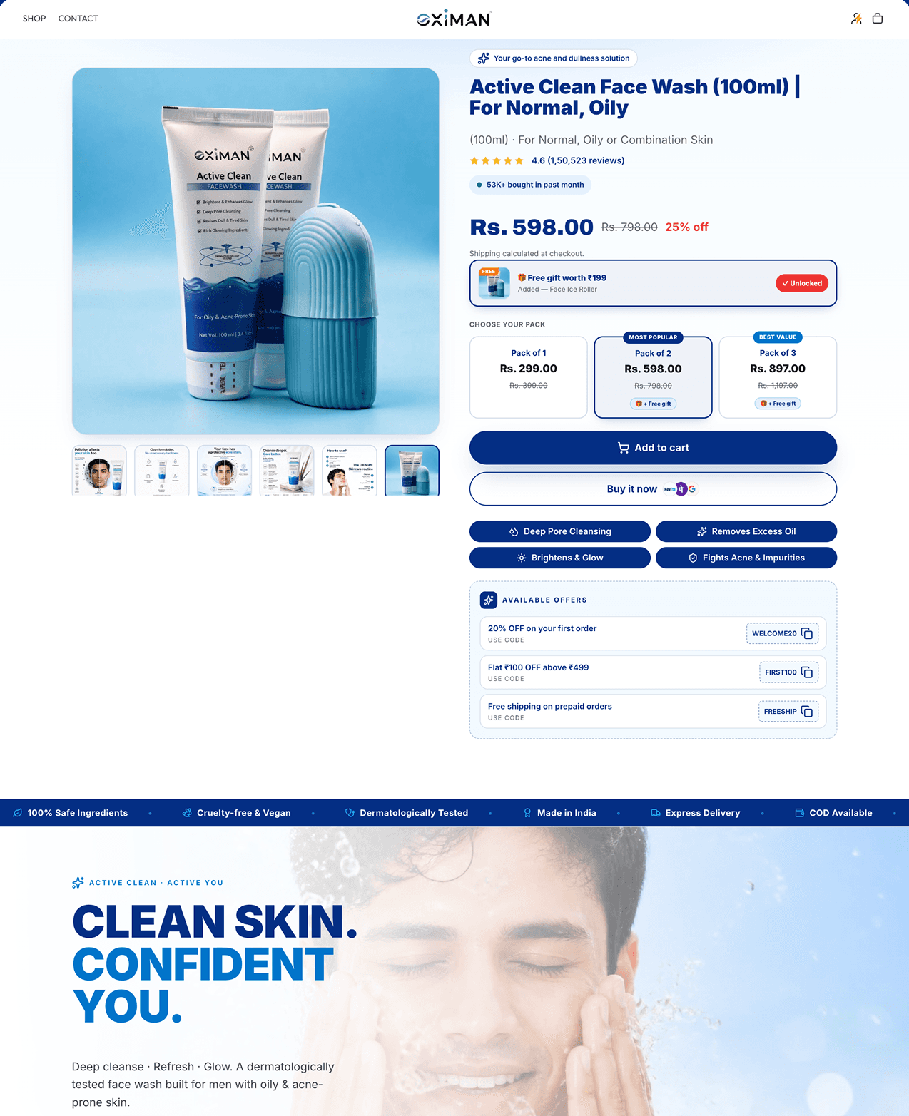
The pack ladder became a real ladder. Packs of two and three are badged most popular and best value, and — the change that does the work — each carries a free gift, so trading up unlocks something rather than simply costing more. The page now defaults to the two-pack instead of the cheapest option.
That free gift is the ice roller the old page was trying to sell separately. Turning a competing ₹199 cross-sell into the reason to buy a bigger pack costs the same margin and asks the customer for one decision instead of two, and it shows on the page as an unlocked state rather than a promise.
The proof moved up to meet the decision. The review count is restated as 4.6 from 1,50,523 reviews beside the title, joined by a “53K+ bought in past month” badge, and a one-line positioning pill frames what the product is for before any of the detail. Add to cart is now paired with Buy it now and its express payment options.
Underneath the buttons we put the four things buyers actually ask — deep pore cleansing, excess oil, brightening, acne — as chips rather than paragraphs, and surfaced the offer codes that previously had to be discovered at checkout. A trust bar and an editorial section carry the brand story below the fold, where it belongs.
Before and after
See the difference.
Product page
The original against the rebuild.
The outcome
This engagement ran before the current reporting setup, and the A/B testing app it was measured in has since been removed, taking the results with it. We are not publishing a figure we can no longer produce the evidence for, so this page shows the work rather than a number. The redesign is live and the comparison below is exactly what changed.
Services in this project
Got a project?
Let’s build yours next.
Tell us your store URL and what you’re trying to solve. You’ll hear back within one business day — an honest read on whether we’re the right fit.